
This post was originally published on this site
Reports of the U.S. stock market’s death appear to be greatly exaggerated.
I’m referring to the dreaded “death cross” that has now appeared in the price charts of the three major U.S. stock market averages. A death cross occurs when an index’s 50-day moving average drops below its 200-day moving average. The S&P 500
SPX,
is the most recent of the major averages to succumb, in mid-March. The death cross showed up in the chart of the Dow Jones Industrial Average
DJIA,
in early March, and for the Nasdaq Composite Index
COMP,
in mid-February.
It’s not clear that the death cross is in fact the “kiss of death.” In many cases historically, the stock market performed better after registering a death cross than it did the rest of the time.
The last time that all three of these averages endured this technical pattern was in March 2020 — just as the COVID pandemic tanked the U.S. economy. Far from presaging a significant drop in the market, that month’s death crosses came within days of the launch of one of the most powerful bull markets in history.
That’s just one data point, of course, and there are many reasons why one could argue that March 2020 was an exception. But in this case it is more the rule.
Consider what I found upon analyzing all the death crosses in the U.S. market since 1990. I chose that starting date because the early 1990s were when it first became possible to easily trade in and out of the entire stock market with a single transaction while also incurring minimal transaction costs. The SPDR S&P 500 ETF
SPY,
for example, began trading in January 1993.
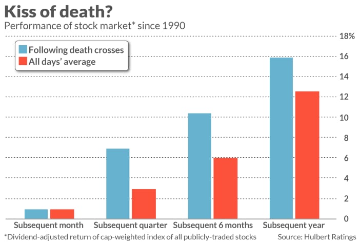
The chart above reports the results for a total-return index of all publicly-traded U.S. stocks. As you can see, this index’s average one-month return subsequent to a death cross was no different than on all other days. But over the three-, six- and 12-month periods subsequent to death crosses, this index did significantly better than at other times.
The death cross’s track record is better from 1928 through 1989. Crucially, however, these results don’t take transaction costs into account. That’s a significant detail, since for much of that six-decade period any attempt to trade into and out of all the stocks in a stock market index would have incurred huge transaction costs. When adjusting for reasonable transaction costs, the death cross prior to 1990 fails just as much as it did after 1990 to identify periods in which the stock market would be a weak performer.
This doesn’t mean that the stock market won’t do poorly in coming months. It may, of course. But if it does, it won’t be because the major market averages recently suffered death crosses.
Mark Hulbert is a regular contributor to MarketWatch. His Hulbert Ratings tracks investment newsletters that pay a flat fee to be audited. He can be reached at mark@hulbertratings.com
Plus: The S&P 500 experienced a death cross. Here’s the bright side.