
This post was originally published on this site
Just how hot is the U.S. economy? This striking chart from the so-called bond king, DoubleLine CEO Jeffrey Gundlach, shows it’s sizzling.
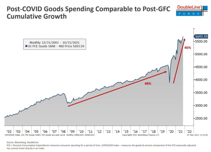
In a presentation to investors, the manager of the DoubleLine Total Return Bond Fund presented this chart, showing that the growth in spending on goods since the pandemic nearly equals the growth in total spending since the 2008 global financial crisis, up until the coronavirus struck the global economy.
It was one of several he presented on the strength of the U.S. economy — surging rent, and the percentage saying now is a good time to find a quality job were others — and how low interest rates are when adjusted for inflation.
Gundlach told investors that the surge in debt means that the rise in borrowing costs will start to weigh on economic growth, saying trouble could emerge when short-term rates surpass 1%, according to Bloomberg News. The flattening of the yield curve reflects this concern, he added.
The yield on 2-year Treasury
TMUBMUSD02Y,
was 0.69%.